


Field-Ready Email Design
Oru Kayak and Condition 1 share a common thread: their customers care deeply about what they buy and why. One makes folding kayaks for people who want to get on the water without a roof rack. The other makes hard protective cases for people who can't afford to have their gear fail. The emails had to match that seriousness — clear hierarchy, purposeful composition, and layouts that work as hard as the products they're selling.
In This Project


My Role
Senior Graphic Designer
Disciplines
- Email Design
- Outdoor Campaigns
- DTC Communications

Layouts Built for Informed Buyers
Neither brand sells on impulse. Oru Kayak's audience researches before they buy — they want to know how the kayak assembles, how it fits the family, whether it folds down small enough for the trunk. Condition 1's audience is evaluating protection specs, case dimensions, and foam configurations. The design challenge in both cases was the same: build layouts that surface what appeals to that kind of buyer, without making the email feel like a spec sheet.
Hierarchy That Does the Work
Each email was built around a clear primary action — whether that was following a Kickstarter campaign, reading a press review, or claiming a seasonal discount. Secondary information was structured to support that action, not compete with it. Product details, comparison layouts, and feature callouts were organized so a reader could scan or read in full without losing the thread.
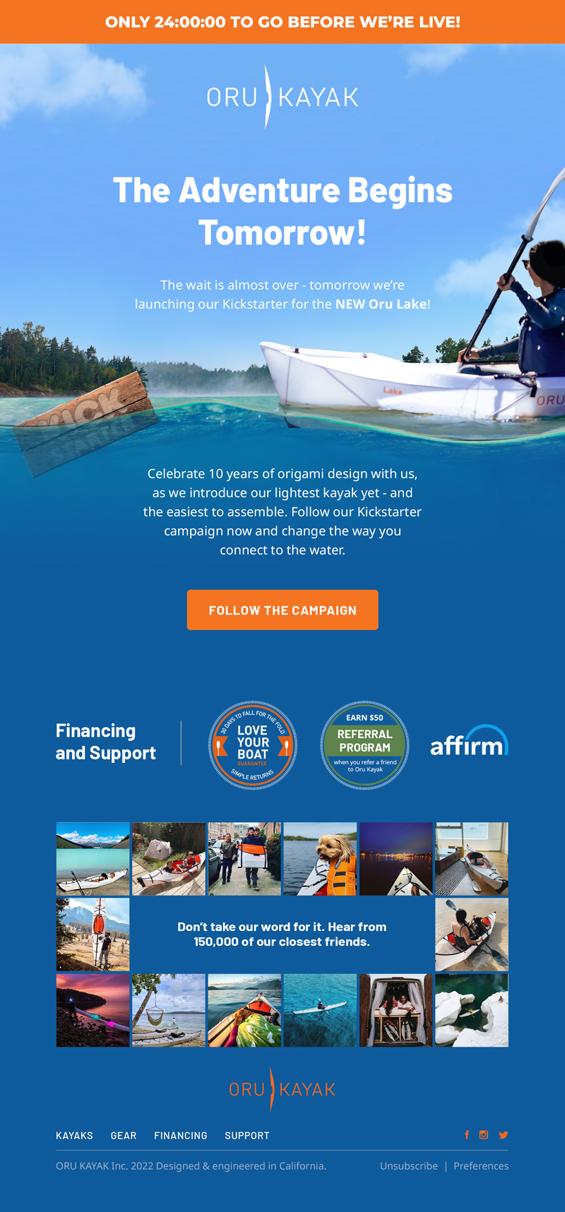
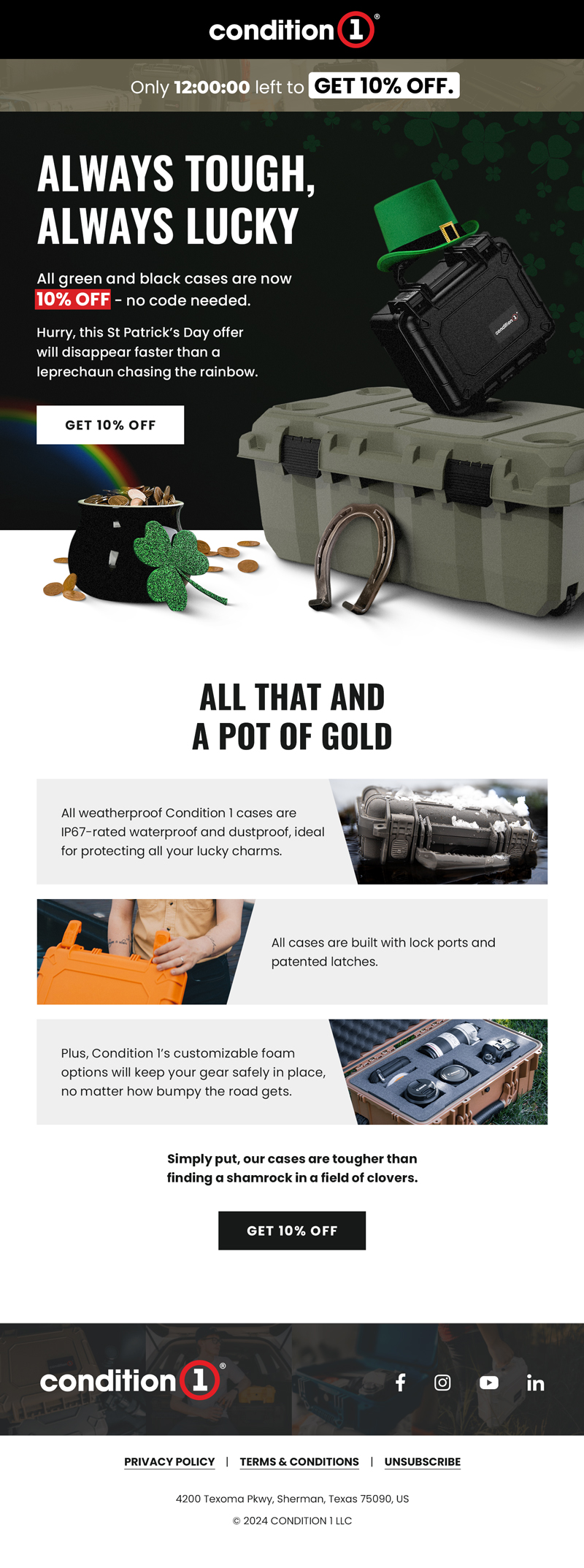

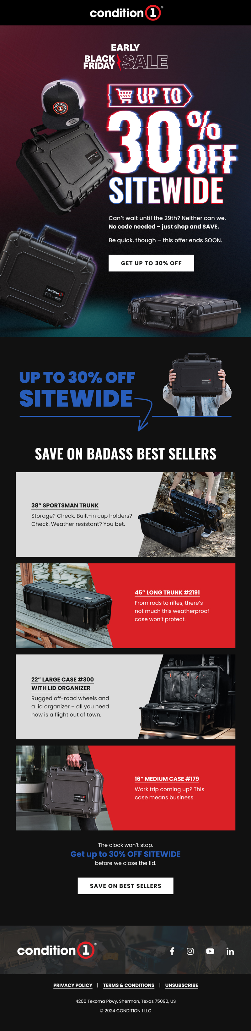
†Desktop layouts are where most visual decisions have room to fully play out. Every email in this collection is also responsive and dark mode-ready — mobile comes with its own constraints and its own design decisions, and an email that only works on desktop isn't finished.