


Email Marketing Agency UI Design
Blog posts, pillar pages, and case studies for an email marketing agency — where the content is technical, the topics are dense, and the reader has every reason to disengage before reaching the end. The design challenge across all eight pieces was the same: take content that could easily become an unbroken wall of text and give it enough structure, visual rhythm, and supporting imagery to hold attention from top to bottom.
In This Project

My Role
Senior Graphic Designer
Disciplines
- UI Design
- Layout Design
- Motion Graphics

Making Complex Content Worth Reading
Email marketing is a technical discipline. The topics covered across these pages are complex and often long — the kind of content that requires depth to be useful, but where that depth becomes a design problem. Without relevant creatives placed throughout, even well-written copy loses readers before they reach the point. The challenge was finding ways to break long content into something scannable without stripping out the substance that made it worth writing in the first place.
Structure as a Design Decision
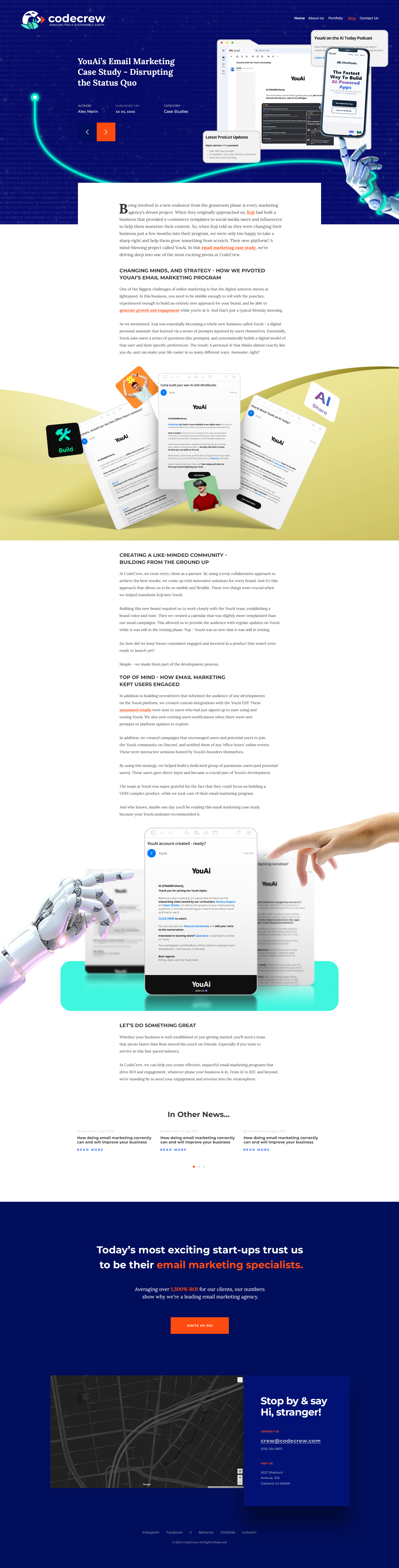
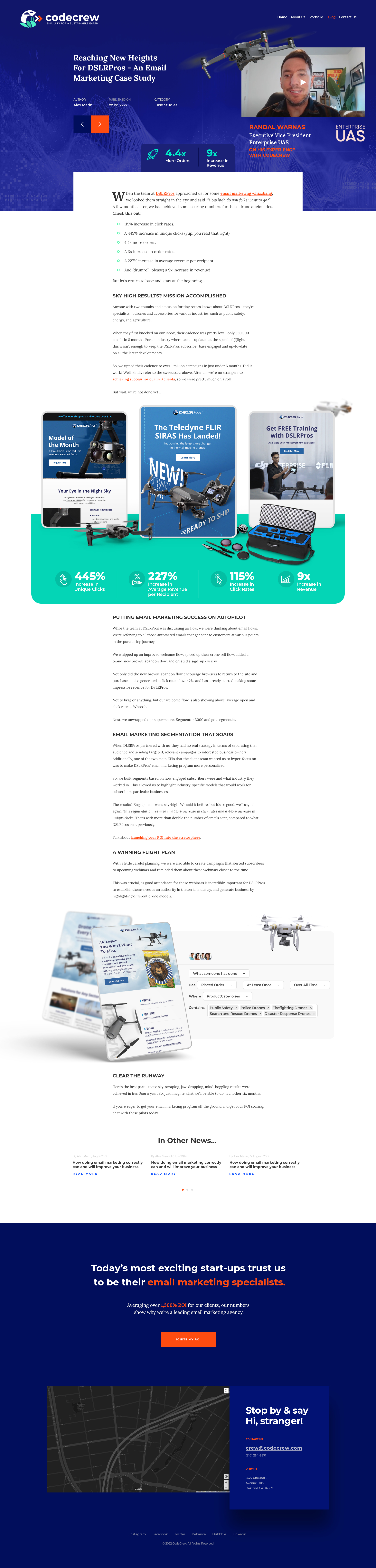
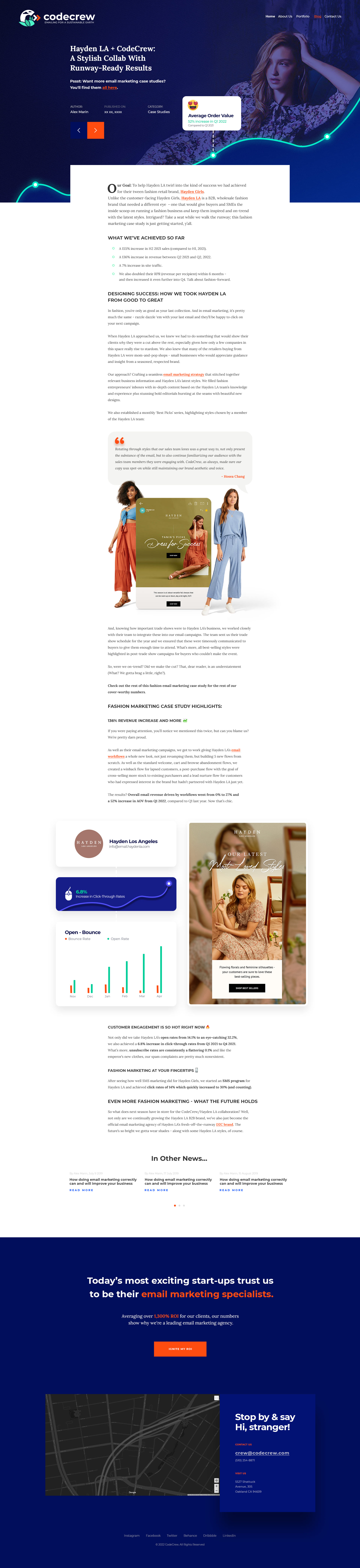
Different content types called for different structural approaches. Sliders and progressive disclosure kept long sections from overwhelming the reader all at once. Tables replaced bullet lists where scanning mattered more than reading in sequence. Alternating layouts and background colors created enough visual variation to keep the reader moving without feeling like they'd already seen what was coming. Animated heroes gave each page a reason to keep scrolling before the copy had done its work. The constraint running through all of it was working with long content on complex topics and making it easy to read — without the reader losing interest halfway through.


†These designs reflect the work as originally delivered. The live pages may have since been updated or changed. Some designs are shown in desktop format only.