Commercial MMS Design

MMS is one of the most restrictive formats in commercial design: a hard file size ceiling, no fallback if the visual doesn't land, delivered directly to the most personal screen a person owns. It arrives uninvited. The visual has to earn its place immediately or it doesn't work at all. This collection spans type in motion, animated compositing, motion graphics, and static depth illusion across four clients — Great Jones, Hayden Los Angeles, PaintNite, and DYPER — each with different visual asks and different brand contexts. The constraint is the same throughout. The solutions aren't.

My Role

Senior Graphic Designer

Disciplines
  • MMS Design
  • Motion Graphics
  • Digital Compositing
  • Kinetic Typography

The Technical Ceiling

Every design decision in MMS has a cost measured in kilobytes. Complex gradients risk banding under carrier compression. Fine typography risks collapsing on smaller screens. Motion that looks smooth at source can stutter when the file is squeezed to fit. The challenge across every piece in this collection was the same: deliver something that reads as intentional and survives the chain from sender to device without looking like it had to fight to get there.

Visual Economy

Solid backgrounds over gradients. High-contrast typography sized for the smallest likely screen. Sharp cutouts and clean composites that give the compression algorithm less to destroy. For animated pieces, limiting the number of elements in motion at any one time so the file budget goes toward what the eye actually notices. The approach isn't minimalism for its own sake — it's minimalism because the channel demands it, and the work is in making that look like a choice.
Depth Without Motion

Depth Without Motion

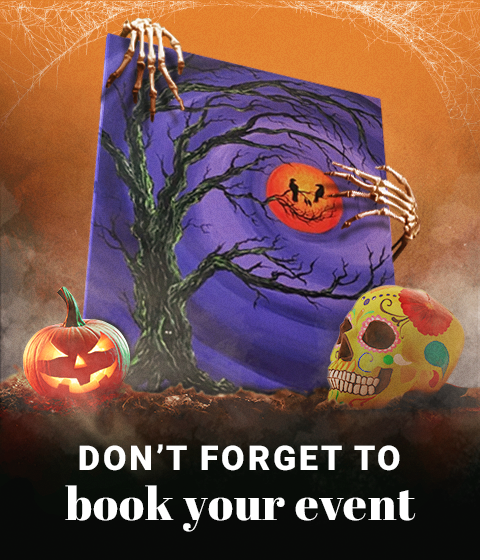
Layers do the work here: a Halloween canvas painting sits at the center, skeleton hands composited gripping its sides from behind the frame, a jack-o'-lantern and a painted skull in front of it, cobweb textures filling the top corners of the orange atmospheric background. Each plane sits clearly in front of or behind the next, giving a static image a sense of three-dimensional space. The canvas as the central prop ties the visual back to PaintNite's product without copy needing to do it.

Polaroid Stack Animation

Against a lifestyle image, a scattered pile of angled polaroid frames sits on top — overlapping, slightly rotated, each one a window into a different part of the collection. In the GIF, the image inside each frame cycles through three distinct looks: warm tones in the first, lighter mixed patterns in the second, and bold black pieces in the third. Showing the range this way keeps the composition feeling like a curated set of photos rather than a product grid, while communicating more of the collection than a single static frame ever could.

Two Panels, One Story

A torn-paper edge divides the frame into two halves, each with its own animation. The left cycles through lifestyle shots of different summer-ready styles; the right shows a model in motion — shifting her attention toward the camera — giving that panel an energy a static product shot wouldn't. The physical texture of the tear creates a tactile break between the two without needing a hard rule or a design-heavy divider. An "Unforgettable Summer" arc text curves across the upper right — tonal, not promotional. The structure lets both sides run independently while reading as a single composition.

Built to Be Shared

Built to Be Shared

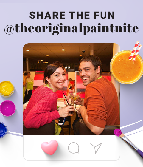
A static MMS encouraging Instagram sharing through a central photograph of two PaintNite attendees framed inside a stylized Instagram post card, complete with interaction icons — the like button rendered as a 3D heart rather than a standard flat icon. Paint pots, brushes, and a drink are composited around the card on a lavender background, extending the event atmosphere into the surrounding space. The design makes the intent clear before the reader has processed a word of copy.

From Pattern to Product

Starting with a full-canvas composition of "STAY COOL THIS SUMMER" in stroke-only text, the GIF animates each word filling in with color one at a time, before the type gives way to the product phase. Models wearing different styles from the collection appear one at a time, each against a coordinating background, with the same type treatment from the opening framing the image as a border. The type phase does the attention work; the product phase does the conversion work.

Product Launch Teaser

Frames from a video capture the full ritual: turning the kettle off, picking it up correctly, and pouring — the product clearly visible throughout, never abstracted away. Botanical illustrations are composited around the frame on a warm cream background, with the Great Jones wordmark anchoring the top. The design builds atmosphere around the product before naming it.

Product Launch Announcement

A solid dark green background — consistent with Great Jones' brand palette — gives the Great Fellow kettle room to sit cleanly without competing with any environment. A yellow starburst badge is present throughout the GIF, its text changing alongside each frame to match what's being shown. The animation ends on the full kettle and its box — the complete product, formally introduced.

Catalogue Depth Through Autocomplete

Using a search bar UI — a format anyone who's used the internet in the last few years will recognize immediately — the GIF shows how much variety the collection has without listing a single product name. Each autocomplete suggestion reveals a different dimension of the range, while behind the search bar, model images cycle through different styles against a neutral background. A handwritten "Dressing for success" script pattern fills the rest of the background.

Background That Speaks

Campaign text repeated and scaled to tile across the entire background becomes texture rather than headline, with models wearing different styles sitting cleanly in the foreground against it. The message stays present throughout the full composition — embedded in the background rather than competing with the product image for attention.

Emotion First, Sale Second

The GIF opens with a father holding a baby aloft against a flat beige background — clean, nothing competing — with "MASSIVE BLOWOUT" in oversized black type above them. The text alternates between stroke-only and filled states, then the figures blur as product cards animate in on top: individual DYPER products on sale, each with a starburst badge. The GIF ends on a yellow card with a kid in the foreground and "AND MUCH MORE" in large, bold type in the background. The transition moves from brand moment to sale catalogue without a hard cut.

The Product Lives Here

DYPER-branded marquee strips run across the top and bottom of the frame, each carrying "LIMITED TIME OFFER" text scrolling continuously — referencing physical sale signage. The central image shows a hand opening a kitchen cabinet to reveal stacked DYPER boxes inside. The cabinet discovery composition implies the product already belongs in the home, found rather than sold. The marquee strips above and below carry the urgency so the central image doesn't have to.

Back to Portfolio