

From First Draft to Final Send


Design work looks clean once it's finished, but getting there almost never is. Directions get discarded before they're ever polished, the rules get broken on purpose in a rough sketch, then followed on purpose the moment a direction is chosen. Those are the parts of the process a portfolio doesn't usually show, from the first read of a brief to the finished file.
Before the Canvas
You might think design is just moving pixels around. It isn't, not at the start. The process starts with reading whatever context exists about the campaign: the content, the strategy, the brand guidelines. What's the offer? Who's the audience? What has to be in the email, and what's the hierarchy of those elements? These are all questions you need an answer for before you even open your favorite design tool.
Skipping this step costs more than it saves. Suddenly the offer and discount code are overshadowed by a Gen Z-styled image, in an email addressed to an audience that's entirely millennial. That's not a five-minute fix once the whole layout is already built around the wrong thing.
For campaigns involving unfamiliar subject matter, there's a research phase before any visual work begins. Not knowing an industry or a product category doesn't have to be a problem, but designing without addressing that gap first is. An email for a high-end kitchen product needs a different visual approach than one for tactical protective cases. That understanding comes from learning about the industry, the product, and the audience, not from guessing.
References and Visual Research
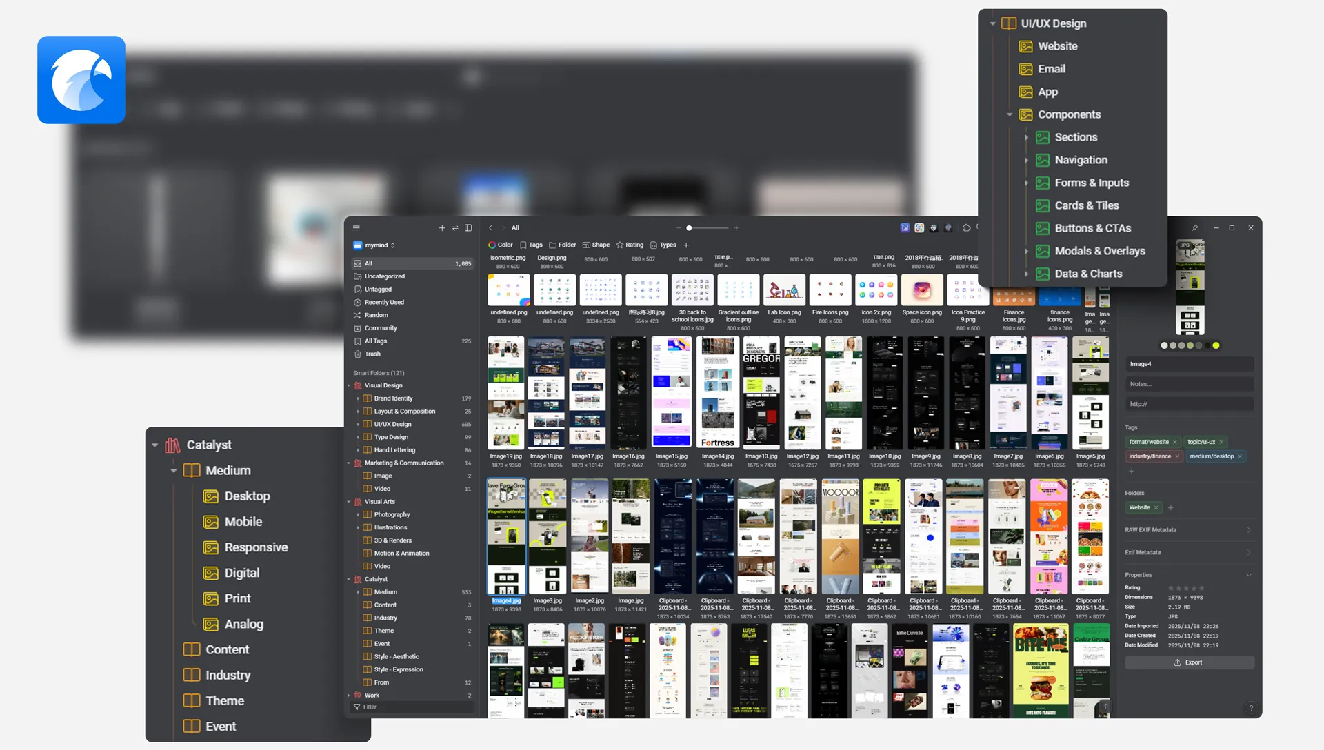
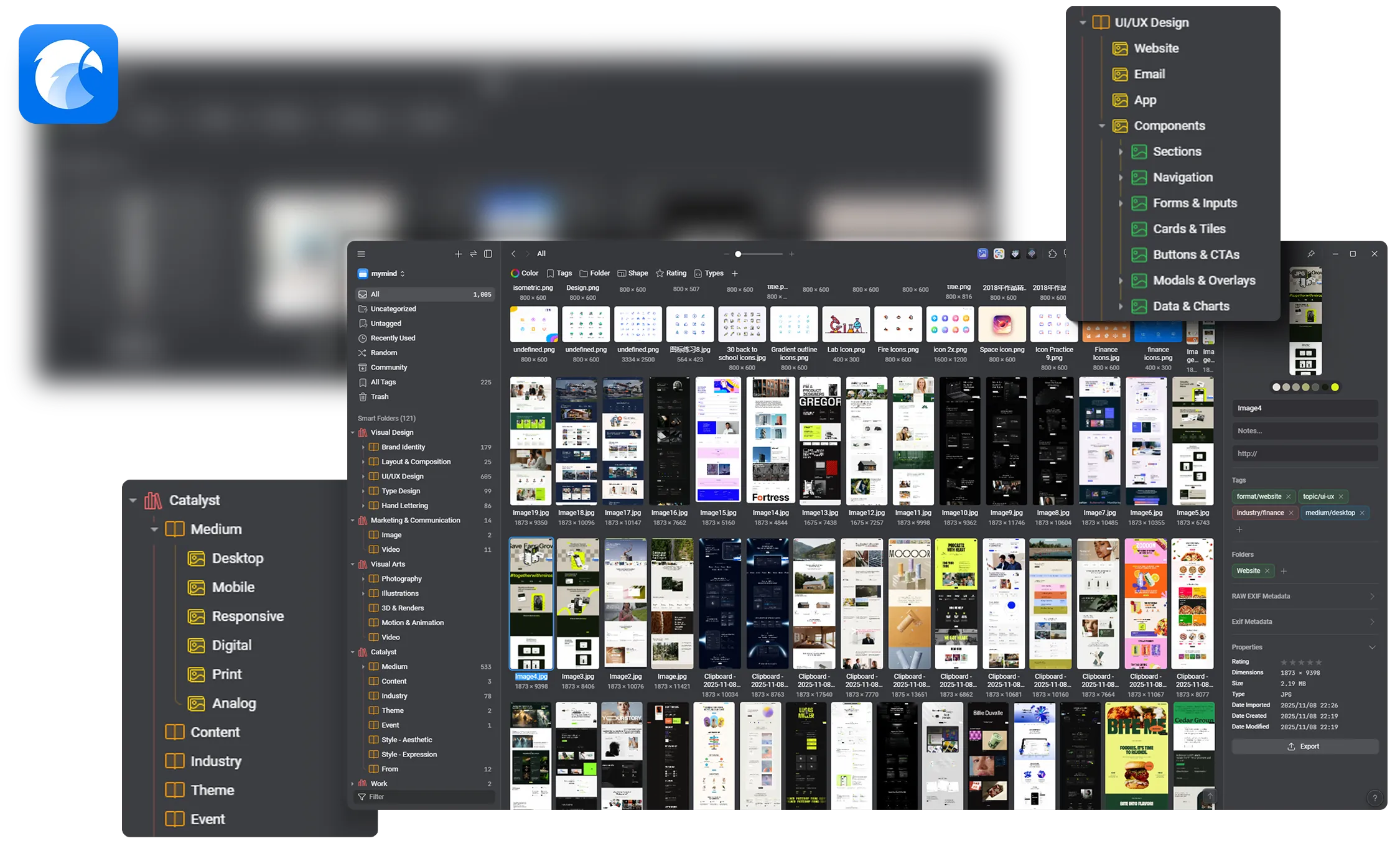
Once the content, the product, and the audience are understood, the reference phase begins. This involves pulling relevant visual references from a personal library. You should have one. And no, ten Pinterest boards from a few years ago don't count. For me, usually this means diving into Eagle.cool — my happy little hoard of neatly tagged, randomly named references — supplemented with external sources where the library falls short. The goal isn't to find something to copy, but rather to understand how a subject is typically visualized: what imagery that industry uses, what visual language that audience recognizes, what has been done well and what's become a cliché.
The Messy Part
The ideation phase doesn't start clean. It starts with raw assets on a canvas: uncropped, roughly placed, not yet at the right size or position, to test whether the basic structure of the information makes sense before committing to any direction.
Visual hierarchy matters more at this stage than polish. If the structural logic of the layout is broken, no amount of refinement will fix it. Finding that out with rough placements takes minutes. Finding it out after six hours of refinement puts pressure on everyone involved in the process.
Multiple Versions in Parallel
Early ideation generates multiple directions simultaneously. Hero text on the left. Hero text on the right. Product dominant. Lifestyle image dominant. Different crops, different proportions, different information hierarchies. These aren't sequential drafts; they're parallel explorations that exist at the same time.
Each direction that shows any promise gets developed further rather than discarded immediately. Some go from rough to final quickly. Most don't. The ones that don't aren't wasted: they establish what doesn't work, which makes the direction that does work easier to identify and easier to defend when questions come up later. It's the difference between saying a direction works and being able to show why the alternative didn't.
Known Constraints, Deliberately Deferred
During ideation, certain production constraints get set aside for now. Blending modes are used freely in Photoshop or Figma, even when they won't survive the export to email. Dark mode rendering isn't checked at this stage. Text-to-image ratio isn't calculated yet.
This is deliberate. Blending modes interact with whatever is beneath them in the layer stack; an exported flat PNG carries none of that information and will look completely different in an email template. During ideation, they're useful for approximating a visual result quickly, getting close enough to the intended look to evaluate whether the direction is worth pursuing before committing to the work of achieving it properly.
The same logic applies to dark mode and text-to-image constraints. How colors actually read against a dark background, which background images make overlaid text hard to read - all of it shapes how the design is built from the start. The checks happen later. The awareness informs every decision made before them.
Once a direction is chosen, the deferred constraints get resolved: blending modes switched back to Normal, the layer adjusted for color, opacity, fill, and sometimes size until it reads the same as before, compositions checked against dark mode behavior, text placement reviewed for coded text viability. The end result looks the same, but the file structure is completely different.
Some issues are hard to spot on light mode. Some don't even show up until you get to dark mode.
Making It Work
The ideation phase produces something that looks right on screen. From there, it goes to development, where the file gets rebuilt to actually function correctly in an inbox. In email, the specific constraints are: dark mode rendering, text-to-image ratio, and structural limitations in HTML email layout.
Dark Mode
Around 35% of measurable email opens now happen in dark mode. A layout that looks correct on a white background in the design file will behave differently when rendered by an email client in dark mode: sometimes subtly, sometimes completely.
Email clients handle dark mode differently. Some invert all colors, some invert only light colors, some leave images untouched, some don't. A gray logo that reads clearly against a white background can nearly disappear once the background flips dark. Text that reads clearly over a background image in light mode can lose all its contrast in dark mode.
These aren't unpredictable problems. They're knowable ones, though only once somebody's actually looked. Take light mode and dark mode as an example: getting good contrast and hierarchy on light mode is the easy part. Dark mode is where it gets tricky. The coder checks how those same colors actually behave on a real device, the first time a color gets used. After that, it's a lookup, not a new question, campaign after campaign. New colors are usually where this breaks: the ones nobody's checked yet.
Text-to-Image Ratio and Coded Text
Whether a piece of text in the design gets rendered as live HTML text or embedded inside an image isn't just a technical detail; it affects deliverability. Spam filters can't read text that's inside an image. Emails that are mostly image, with only a small amount of real, readable copy in the HTML itself, are more likely to be flagged before they reach the inbox.
Email on Acid's testing across 23 spam filters found that emails with 500 or more characters of HTML text pass filters regardless of image count. Which is why text the reader needs to read, copy, or act on gets designed so it can be coded as live text, wherever the layout allows it.
A discount code like "SUMMER25" can exist as part of an image without causing much friction; it's short, memorable, and most readers won't need to copy it. A discount code like "DFA921Q1" needs to be built so it can be coded as live text, or set up so it applies automatically at checkout. If a reader can't copy it, they won't use it.
Structural Constraints
Email HTML doesn't behave like a web page or a print layout, and it's more limited than either. Certain configurations that work fine on a website, or that are easy enough to compose in Photoshop or Figma, either can't be built in email HTML or require workarounds significant enough to make life harder for everyone involved: a decorative element bleeding across multiple sections, an image stacked on top of a text block, a smooth gradient background.
Knowing which configurations are possible and which aren't is part of the design work. A layout that requires the developer to solve a structural problem that could have been resolved at the design stage costs time twice: once when the developer already tried to build it before hitting the wall, and once when the design gets revised afterward.
Still a Work in Progress
A good process matters, but there's no magic formula behind building one. It happens the same way the emails do: draft, break, fix, repeat.
My workflow didn't start with a dark mode reference or a habit of (re)reading the brief thrice. Those came later, learned over years of handing files to development and paying attention to what actually made their job easier. That also meant fewer and fewer changes needed after a design was approved, until most projects needed none at all. The file arrives prepped the way development wants it from the start, dark mode and every small detail already accounted for.
None of this is fixed. It's built to keep changing, the same way it always has, shaped by whatever environment it runs into next.