


Designing for Seasonality


A Black Friday email and a spring campaign don't just look different. They have to work differently — different layout logic, different typographic weight, different color temperature, different pace. This is a study in how those decisions get made, and why getting them wrong costs more than it looks like it will.
The Problem With Seasonal Decoration
Most brands treat seasonality as a cosmetic layer. Generic snowflakes in December. Off-brand flowers in May. A green banner for St. Patrick's Day that could belong to any company. The visual changes, but the email structure underneath stays exactly the same — same grid, same hierarchy, same pace.
That's a missed opportunity. During the most competitive moments of the calendar, it's also a liability.
The Black Friday and Cyber Monday inbox is not the same place as the April inbox. The reader's state of mind is different, their tolerance for friction is different, and the number of emails competing for their attention is dramatically different. Email volumes rise substantially during peak retail seasons like Q4 holidays compared to normal periods. An email designed for a quiet Tuesday in March won't survive that environment unchanged.
Seasonal design isn't decoration. It's a recalibration of the entire visual system to match where the reader actually is.
High Urgency: Designing for the Inbox Arms Race
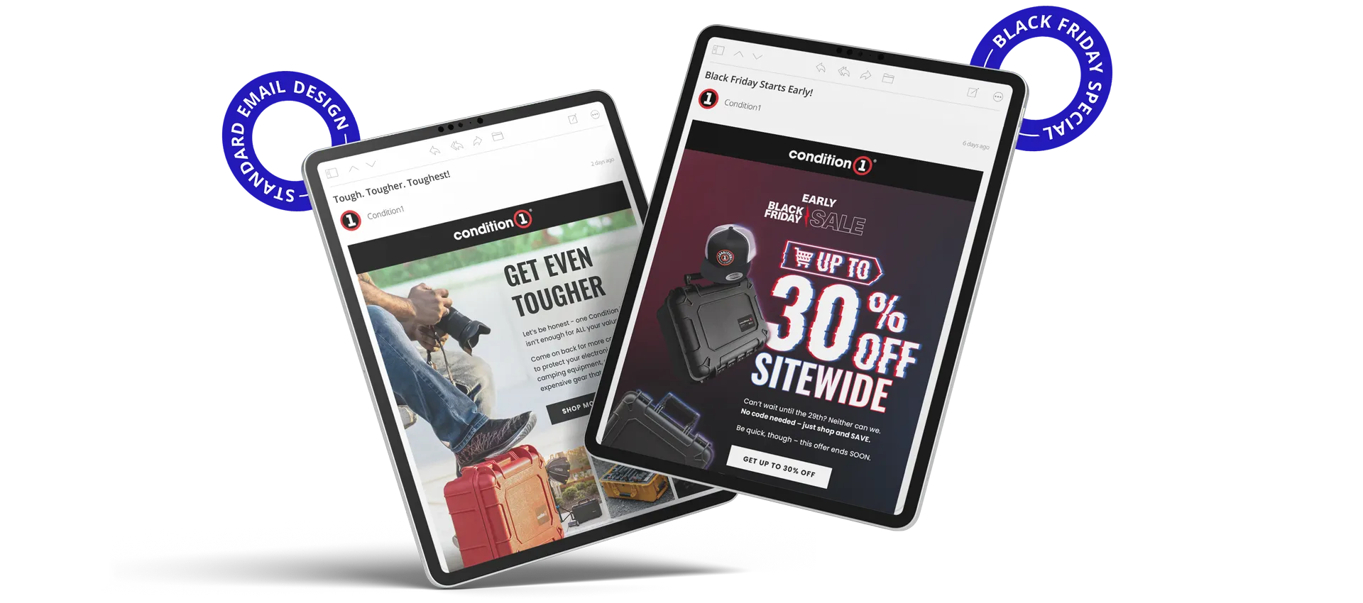
Black Friday and Cyber Monday represent the most compressed attention window in retail. Readers aren't browsing — they're scanning for a reason to stop, and they're doing it on a phone. Mobile devices drove 56.4% of online orders during Cyber Week 2024, reaching 65% on Christmas Day. That's not a detail to design around. It's the primary constraint.
Stripping Back the Layout
At peak urgency, nuance becomes friction. Copy condenses to the minimum required to communicate the offer. Every element that isn't directly serving the conversion gets removed. The fewer choices a reader has to make, the faster they can act. At high urgency, speed is the design value.
Typography as the Primary Visual
Discount-led emails during peak sale periods work best when the offer dominates the visual field before anything else is processed. Large, high-contrast typography — often filling a significant portion of the viewport — ensures the value proposition lands before the scroll begins. This also matters because 80% of people delete an email that doesn't look good on their mobile device. A type-led composition is more resilient to rendering variations than an image-heavy one.
Palette Shift
A deliberate palette shift — moving away from the brand's standard background to something that matches the season's visual language — is one of the most effective ways to stand out in a crowded inbox. For a peak sale moment, that might mean switching to a darker, higher-contrast treatment. For a spring campaign, it might mean introducing pastels that wouldn't fit the brand at other times of year. In both cases, the palette signals clearly: this moment is different.
Atmospheric Seasons: Designing for Consideration
Between the urgency peaks, the inbox changes. Readers aren't scanning for a reason to stop — they're browsing. The design can slow down. Fall feels like transition; spring feels like a fresh start. Emails that pick up on those cues work with the reader's state rather than ignoring it.
Editorial Pace
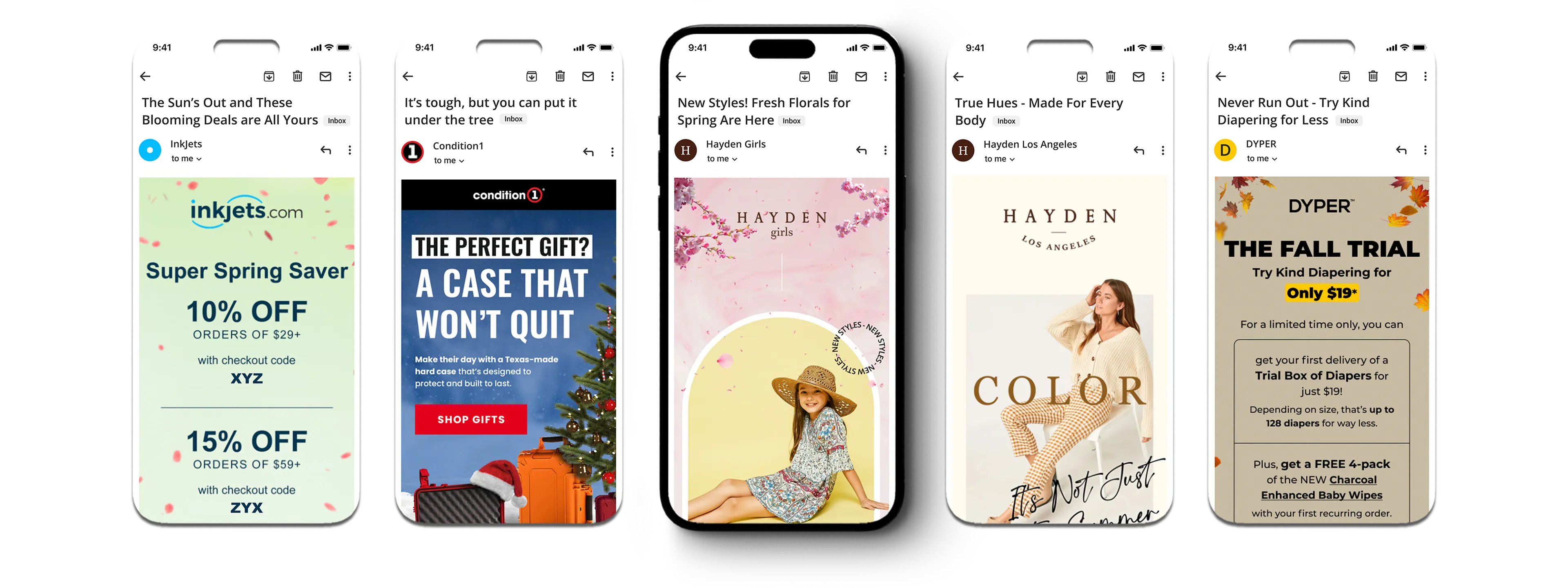
The grid opens up. Whitespace returns. Photography takes up more of the canvas, with less text competing against it. Product specs recede; context and lifestyle imagery advance. The reader is being invited into a feeling that happens to have a product in it.
Soft Palettes and Warm Tones
Pastels and warm earth tones aren't arbitrary seasonal decoration. They carry specific temperature and mood associations that prime the reader before the product is even visible. A soft pink and cream palette for a spring collection creates a different psychological environment than the same product on a white background. The layout signals the season; the product fits into it.
Designing for the Screen It'll Be Read On
We already established that 80% of people delete an email that doesn't render well on mobile. That stat doesn't change between Black Friday and April — if anything, atmospheric season emails are more likely to be read at a relaxed pace on a personal device, making how the design holds up on smaller screens just as important.
Mobile-responsive design increases unique mobile clicks by 15%. Layout decisions made at desktop scale don't automatically translate — type sizes that read clearly on a laptop become too small to scan on a phone, and multi-column compositions that work on desktop often need to collapse gracefully into a single column on mobile.
Dark mode adds another layer. Around 35% of measurable email opens now happen in dark mode. At the design level, this is primarily about image handling: a logo on a transparent background can become invisible when the email client inverts the background to dark. Adding a stroke around the logo, or exporting it with a solid background color behind it, keeps it visible regardless of what the platform does to the surrounding colors.
Thematic Holidays: The Personality Test
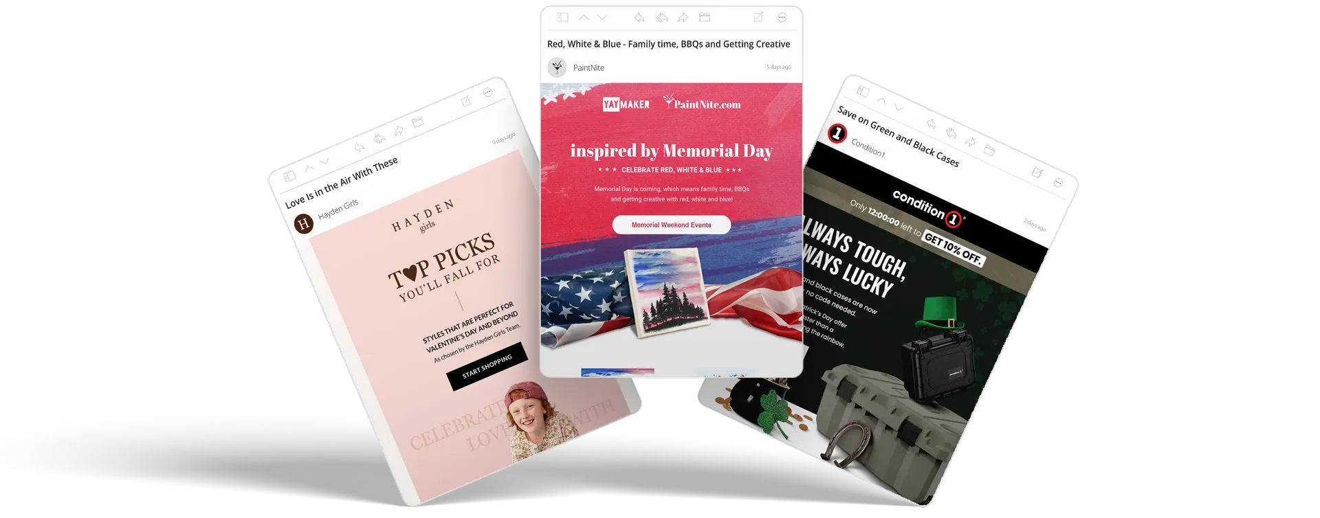
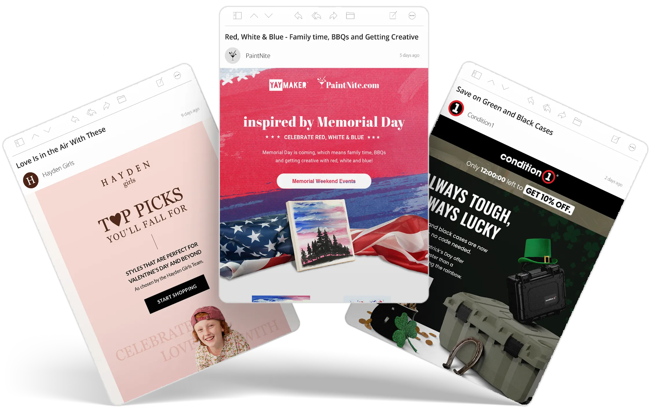
Thematic moments — Valentine's Day, St. Patrick's Day, Memorial Day — sit somewhere between urgency and atmosphere: promotional, but with a visual tone that rewards personality over pressure.
The mistake most brands make here is literalism. Clip-art shamrocks. Cartoon hearts. Themed elements dropped into an otherwise unchanged template. The holiday ends up decorating the brand rather than integrating into its visual language as if it had always belonged there.
Integrating the Palette, Not the Motif
Effective thematic design takes the holiday's color associations and uses them as a design system. Emerald green against matte black for St. Patrick's Day. Red, white, and blue as the structural palette for Memorial Day — as the actual color logic of the email, not as decorative flags or ribbons. The holiday merges with the brand's visual language, feeling like a natural extension rather than a seasonal overlay.
How Far to Lean In
Thematic holidays allow for visual tones that would be out of place at other times of year — warmth, humor, playfulness. The design can carry more personality without reading as off-brand. The challenge is calibrating how far to go. A Valentine's campaign for a girls' clothing brand can be soft and editorial. A St. Patrick's Day campaign for tactical protective cases can lean into the tension between the brand's rugged identity and the holiday's lightness — and that contrast tends to be more memorable than either element alone.
The Calendar Doesn't Wait
Seasonality isn't a visual preference. It's a reading environment that shifts throughout the year whether the design acknowledges it or not.
Treating it as a cosmetic layer means competing against the calendar. The alternative is designing for where the reader actually is.